PROJECT BRIEF
I endeavored to redefine the perception of a laundromat, elevating it from a mundane necessity to an exciting and stylish destination. This portfolio showcases my commitment to enhancing everyday experiences by injecting creativity and innovation into seemingly ordinary spaces.
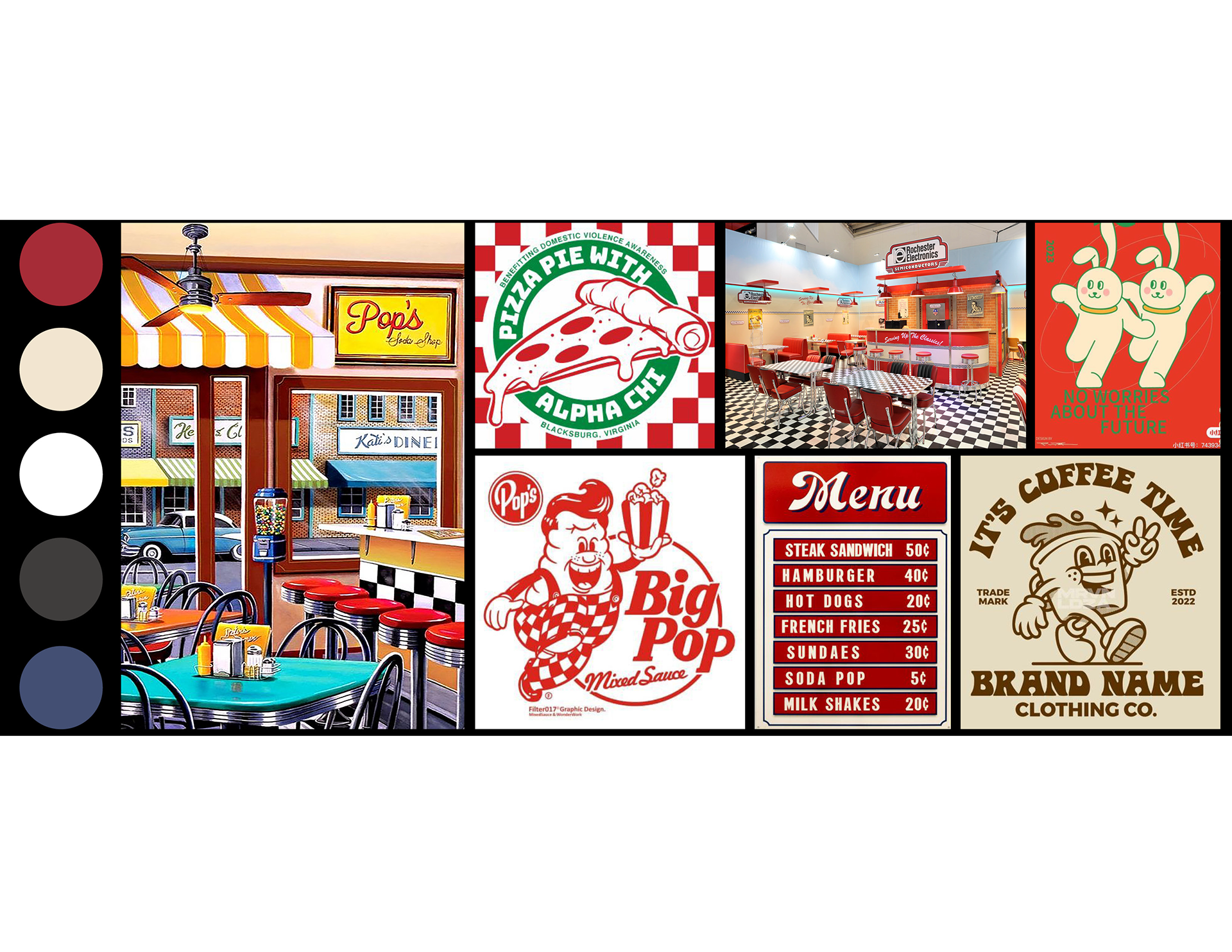
DESIGN INSPIRATION:
In reimagining the conventional laundromat, I sought to challenge the stereotypical notion of a plain, utilitarian space. Inspired by the lackluster interiors of typical laundromats, my aim was to transform this mundane experience into one that is both visually captivating and chic.
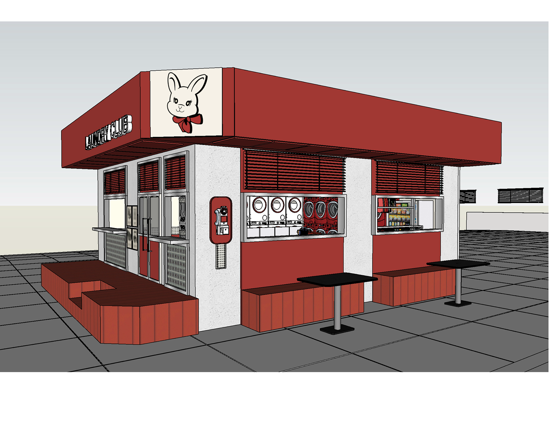
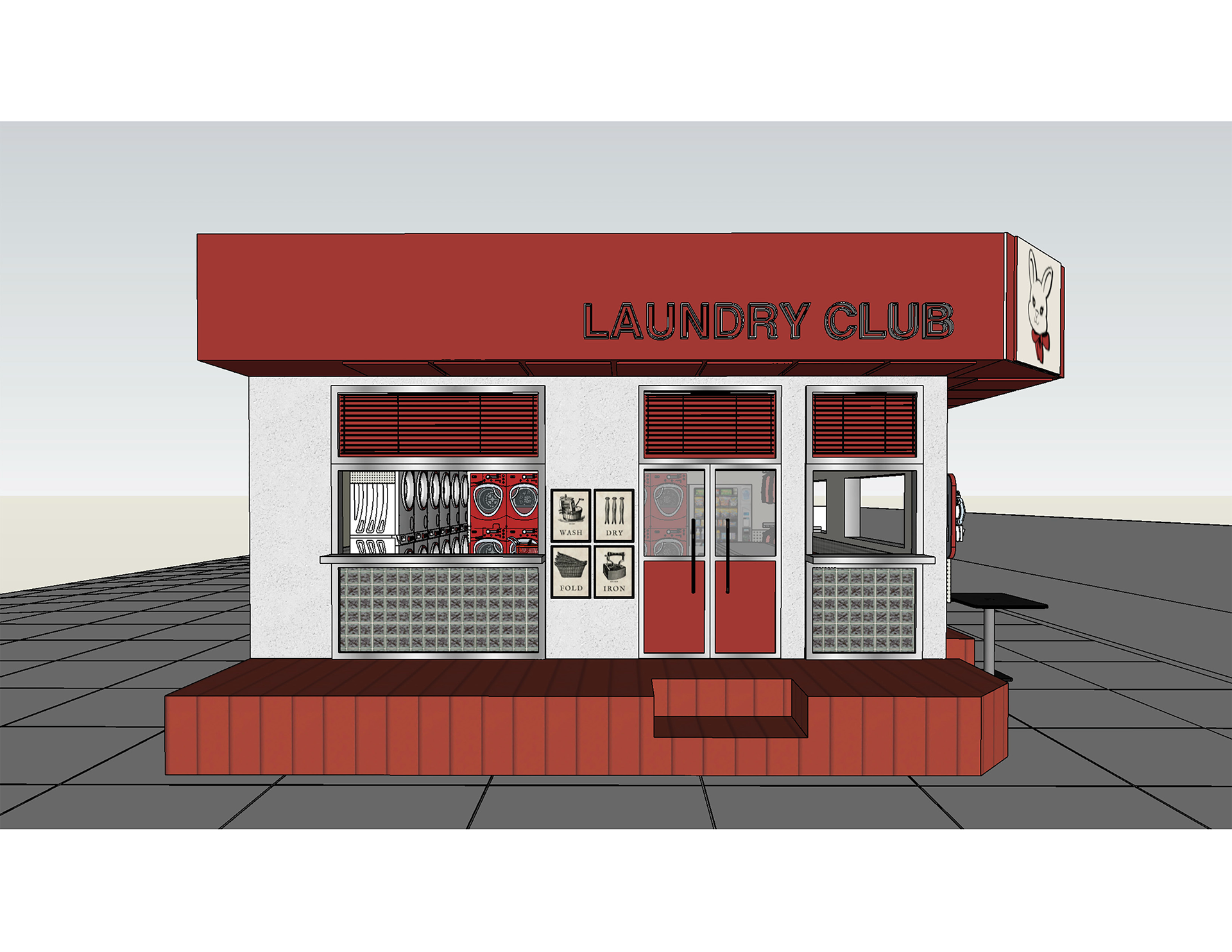
To actualize my vision, I settled on the idea of embracing a retro 50s American diner concept. This thematic choice injects a dynamic retro style into the laundry store, elevating its overall aesthetic to a level of stylishness and artistry, while fostering a sense of fun and excitement. In line with capturing the essence of the chosen era, I opted for a vibrant and eye-catching red as the primary color for the establishment. This bold choice not only adds a pop of color but also symbolizes vibrancy and a funky ambiance.
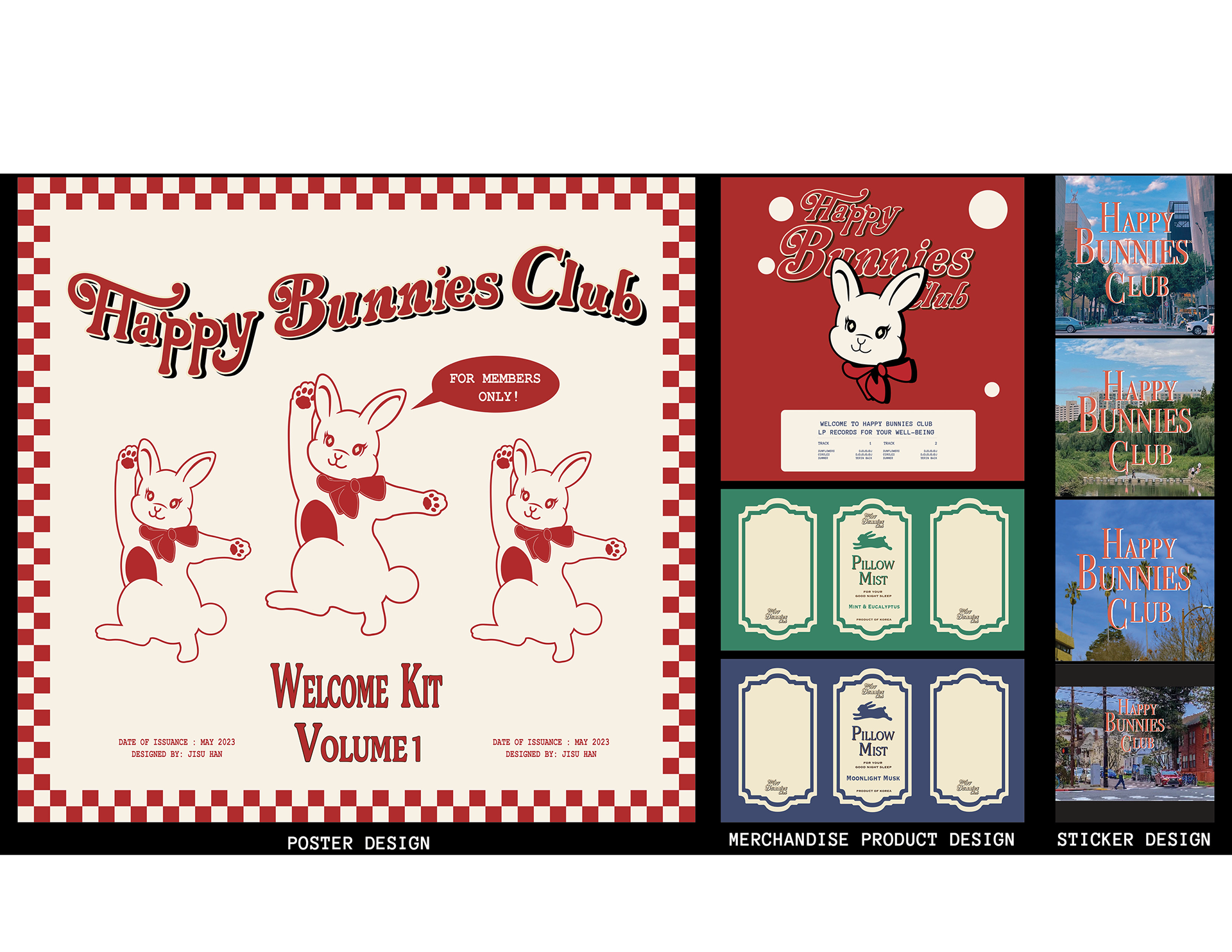
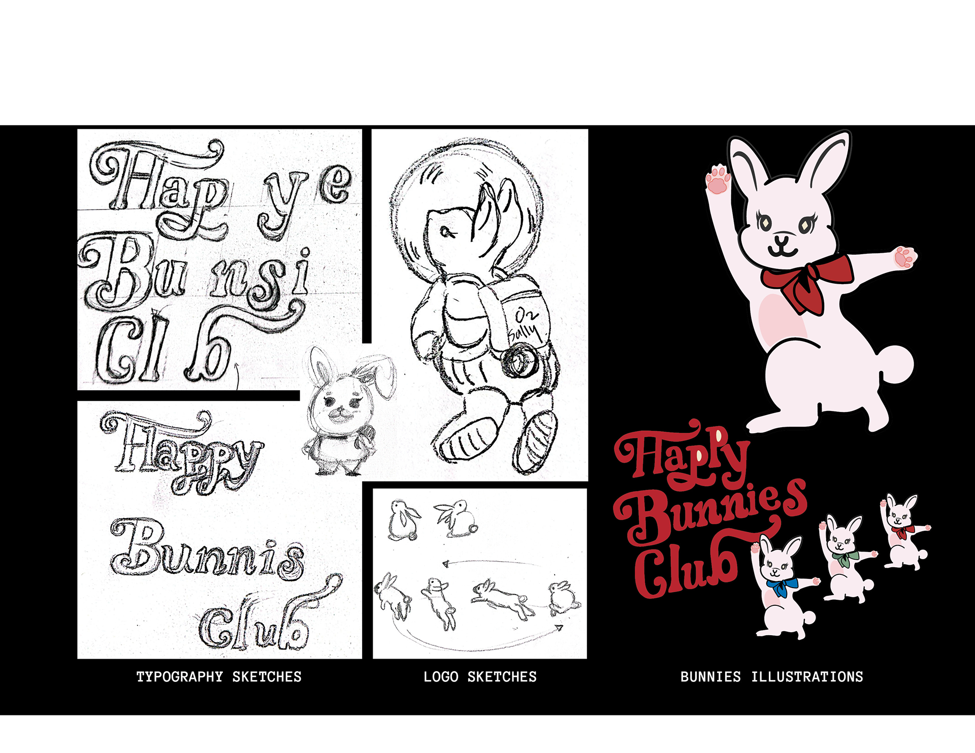
BRANDING AND GRAPHIC DESIGN
I crafted the visual identity for Happy Bunnies Club, encompassing the logotype, poster, and packaging designs. The nomenclature, “Happy Bunnies Club,” is a deliberate choice, with “bunnies” symbolizing the patrons frequenting this laundromat for their laundry needs. The intention behind this whimsical name is to evoke a sense of joy and relaxation for customers during their visits.
SKETCHUP DIGITAL RENDERING
Before embarking on the physical construction of the 3D model, I employed SketchUp for a detailed virtual simulation. The exterior aesthetics of the laundromat were meticulously curated, featuring a warm and stylish ambiance through the predominant use of red. This color choice not only aligns with the brand’s primary color but also contributes to establishing a welcoming and contemporary atmosphere.
Additionally, to infuse a playful and inviting vibe, the iconic bunny logo adorned with a charming red ribbon was strategically placed on the walls. This thoughtfully crafted design element serves the dual purpose of reinforcing the brand’s identity and leaving a memorable, fun-filled impression on patrons. The strategic placement of the logo enhances the overall ambiance, contributing to the creation of a space that is not only functional but also radiates a sense of warmth and friendliness.

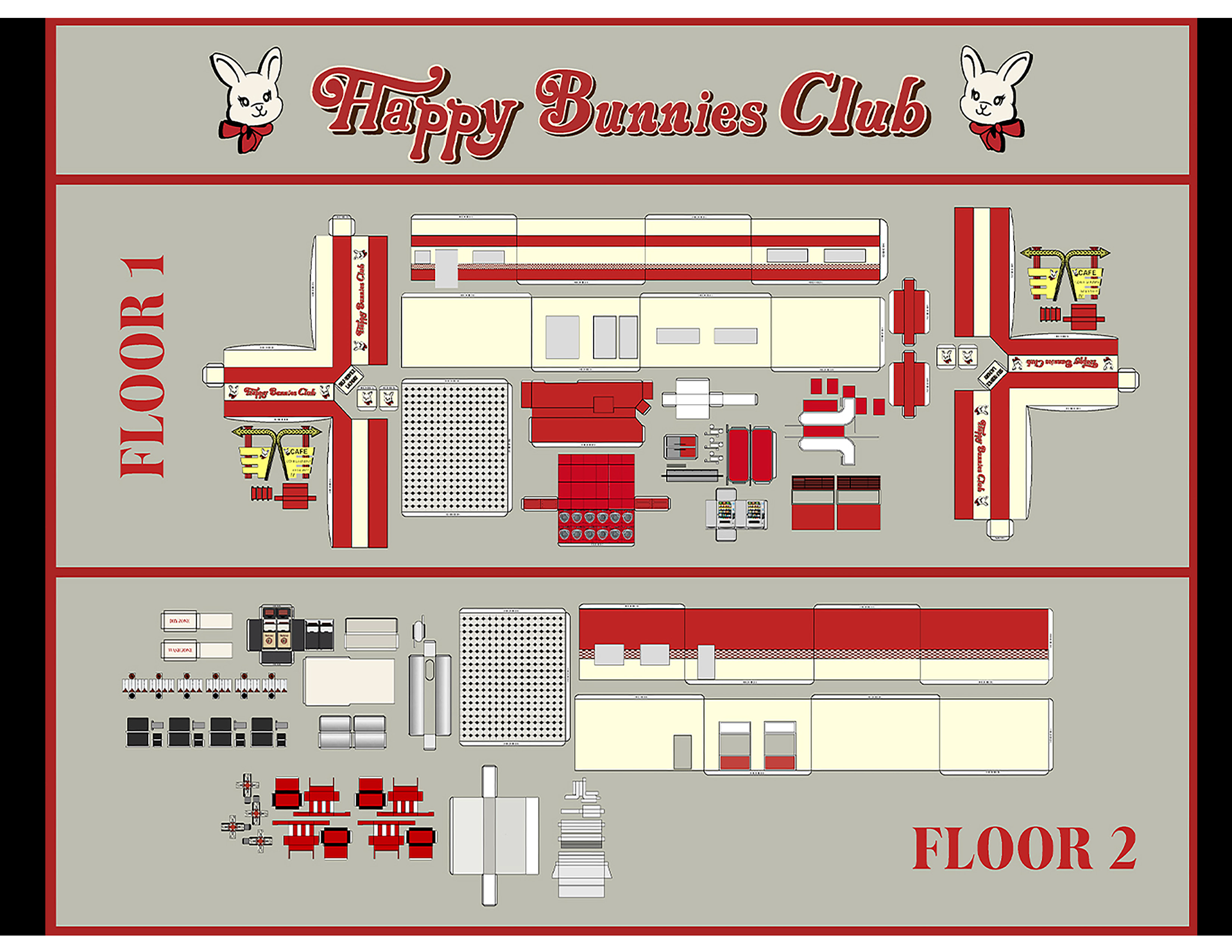
PHYSICAL MODEL
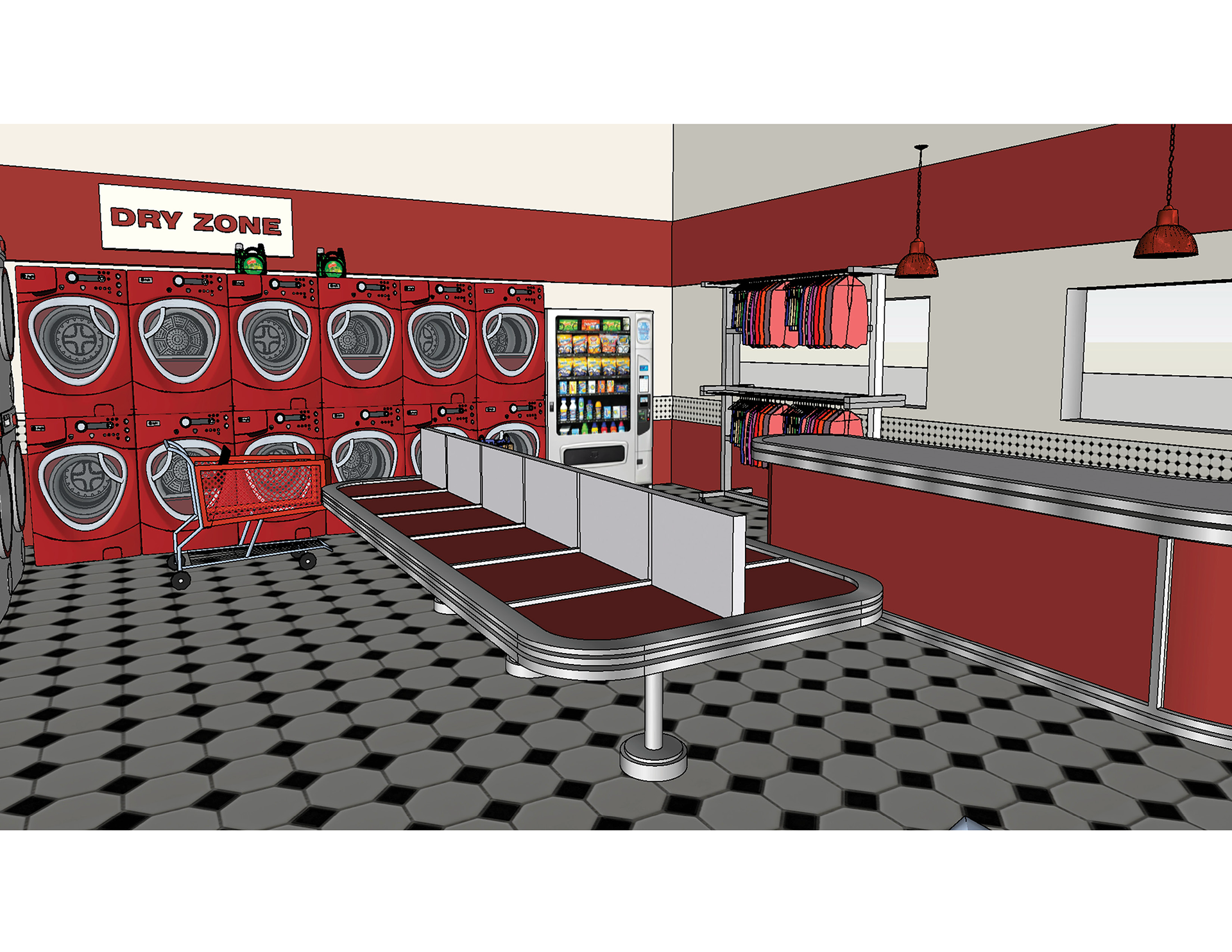
I employed Adobe Illustrator to craft a blueprint for the diorama miniature papercraft. Notably, the addition of a second floor transformed the space into a charming retro-concept cafe, serving as an inviting and trendy waiting area for customers. Then, I printed the drawings onto sturdy paper, folding and assembling them to bring the 3D model to life. The interior of the laundry shop is adorned with a captivating blend of black and white checkered wallpaper, complemented by vibrant red furniture, evoking the nostalgic charm of a 50s American restaurant. The design seamlessly marries functionality with aesthetics to create a visually appealing and immersive environment. A strategically placed front desk not only serves as a central point for customer assistance but also offers additional laundry services such as dry cleaning.