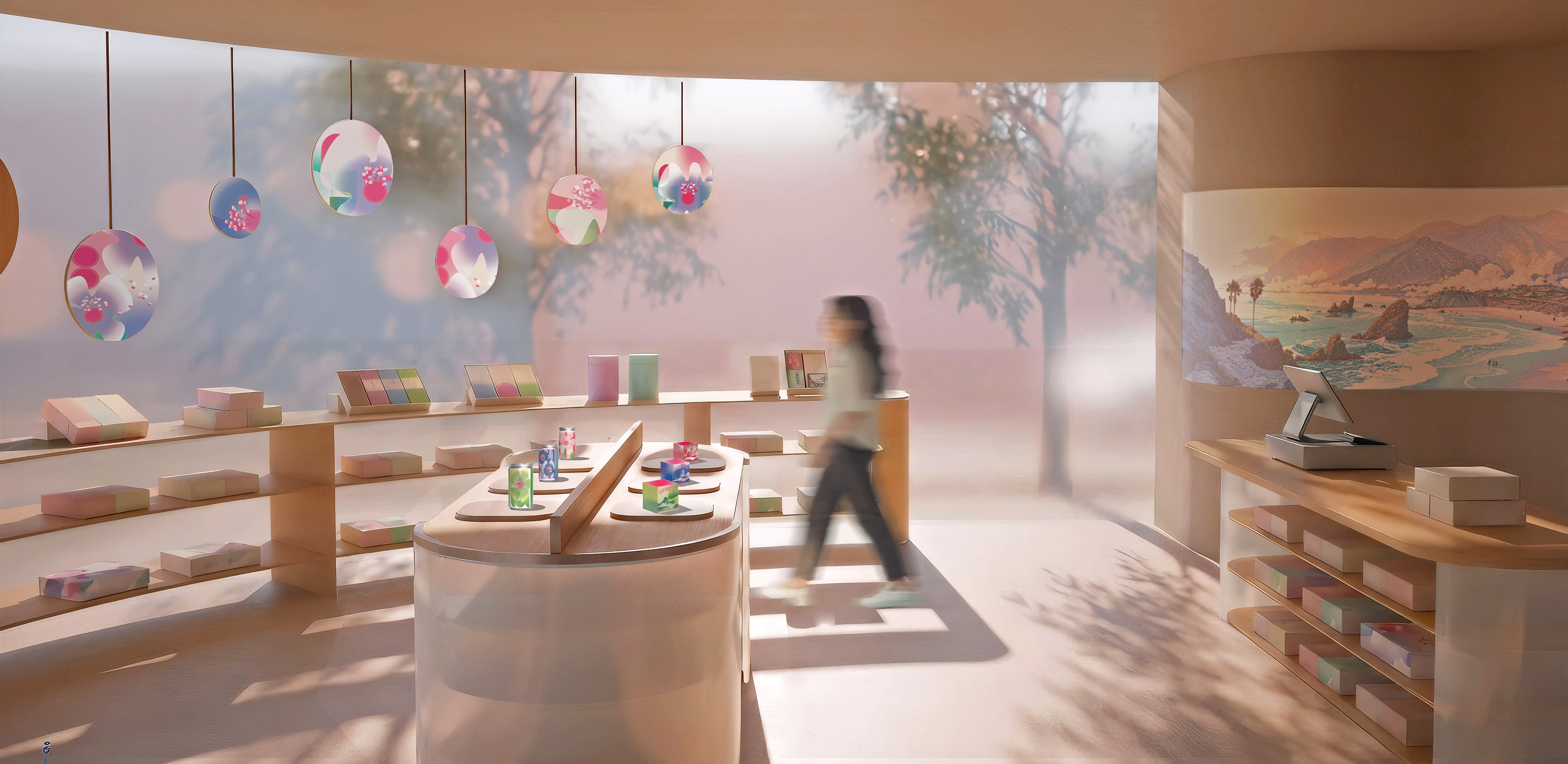
Toraya Teahouse LA: Branded retail and teahouse reimagined through ritual, light, and softness.
Design Story
Toraya reimagines the Japanese tea ritual as a spatial experience shaped by time, softness, and gradual unfolding. Inspired by tea infusion, the space emphasizes translucency, gentle light, and slow movement—inviting visitors to pause and engage with tea as a quiet, multisensory ritual in Los Angeles.
Space Experience

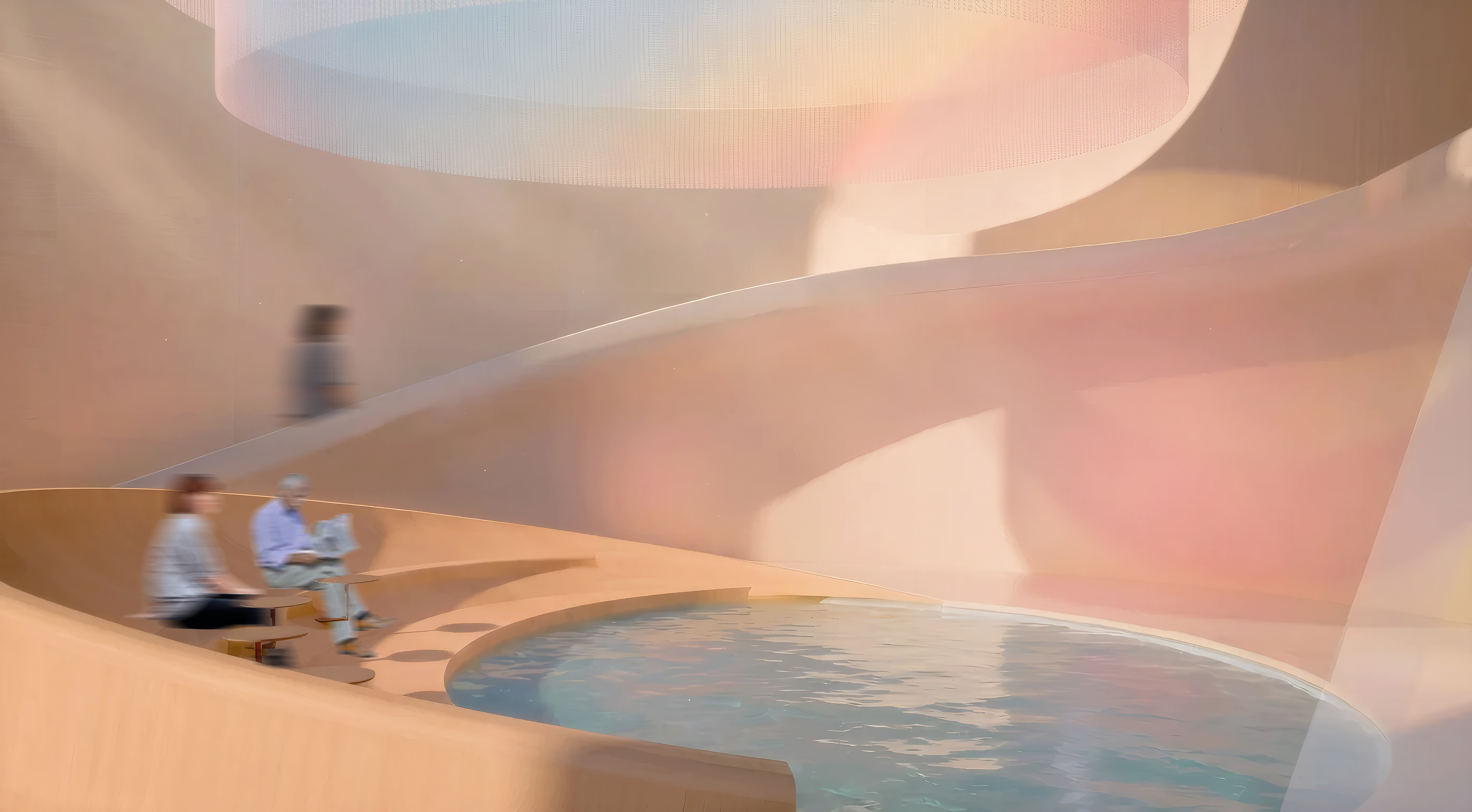
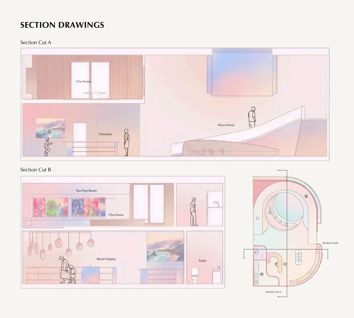
Mizunoma (water room).
A calm, transitional space where light, reflection, and material softness prepare visitors for a slower ritual.
A calm, transitional space where light, reflection, and material softness prepare visitors for a slower ritual.
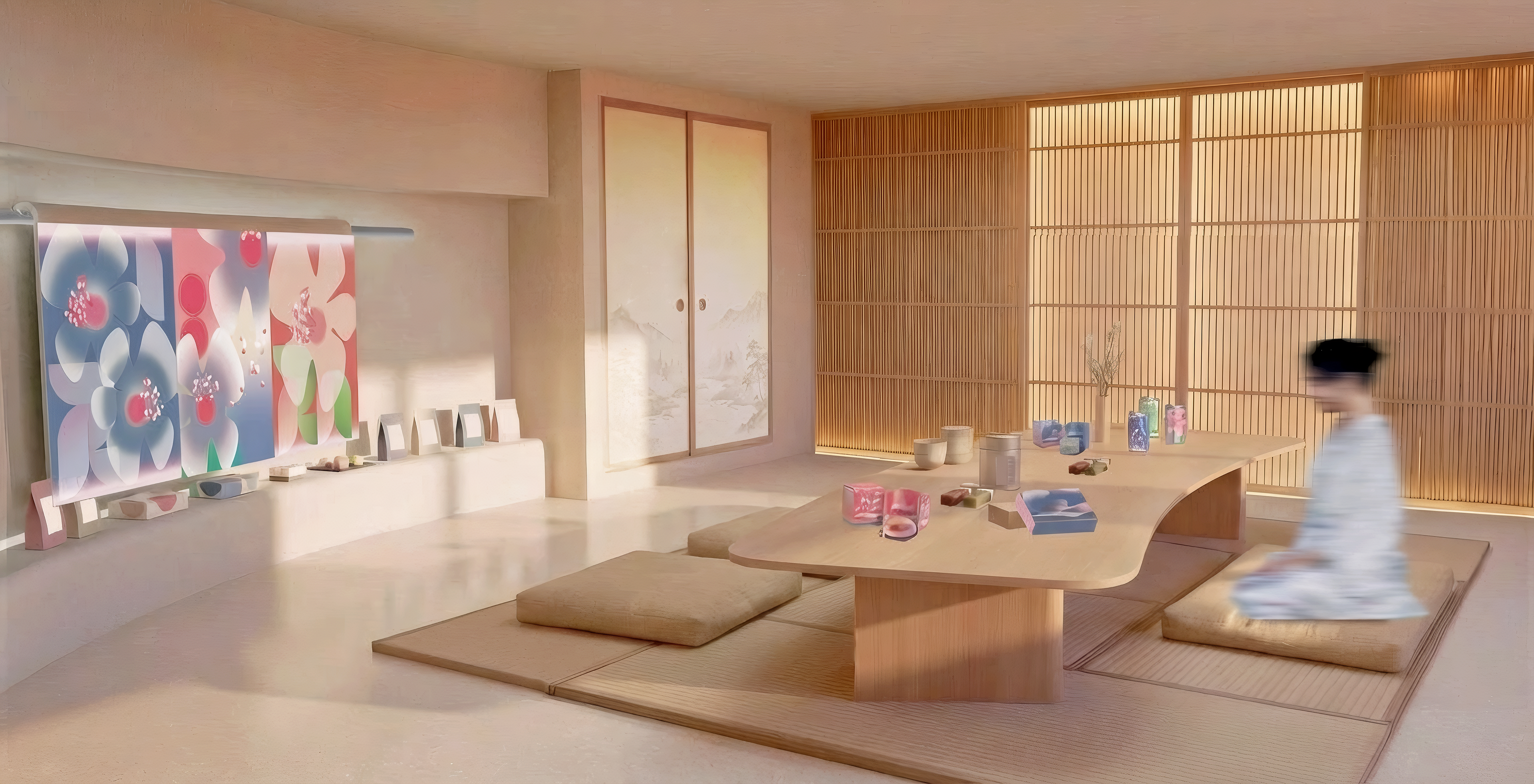
Chanoma (tea room).
An intimate setting for tea and contemplation, defined by filtered light, restrained materiality, and moments of pause.
An intimate setting for tea and contemplation, defined by filtered light, restrained materiality, and moments of pause.
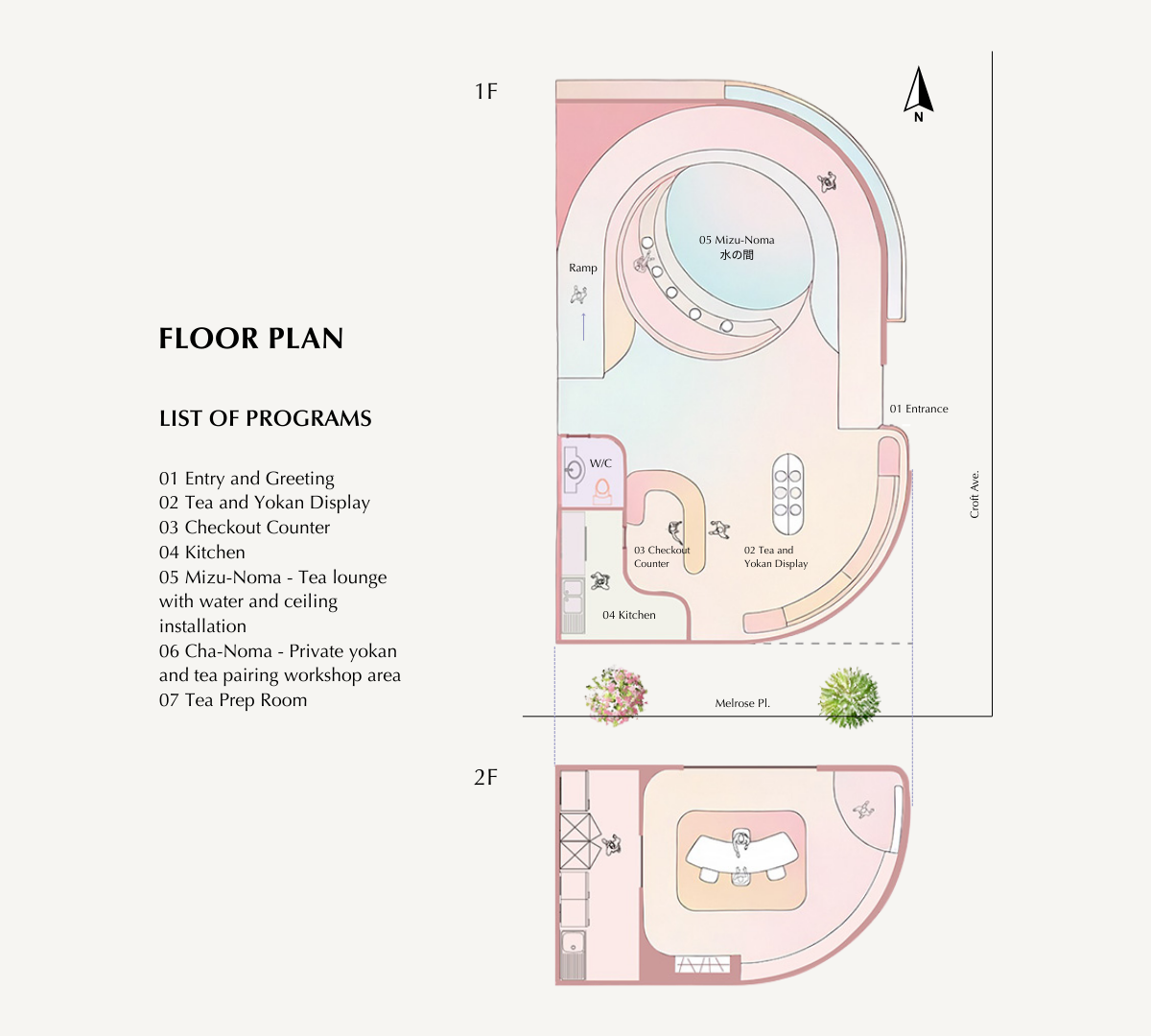
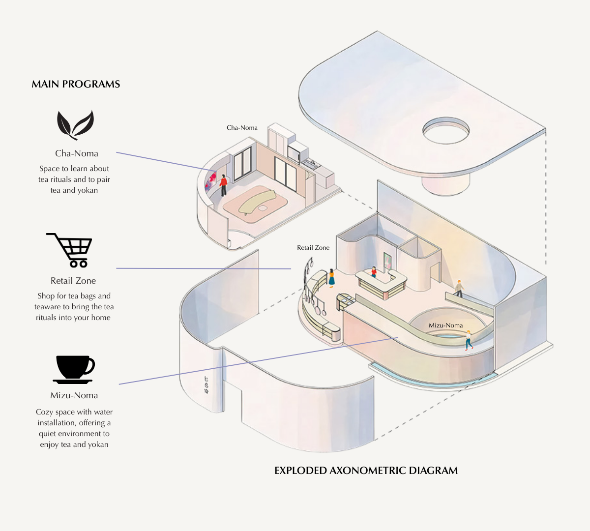
Space Planning
A slow, linear circulation guides visitors from the street into increasingly intimate spaces, reinforcing Toraya’s ritual of arrival and pause.
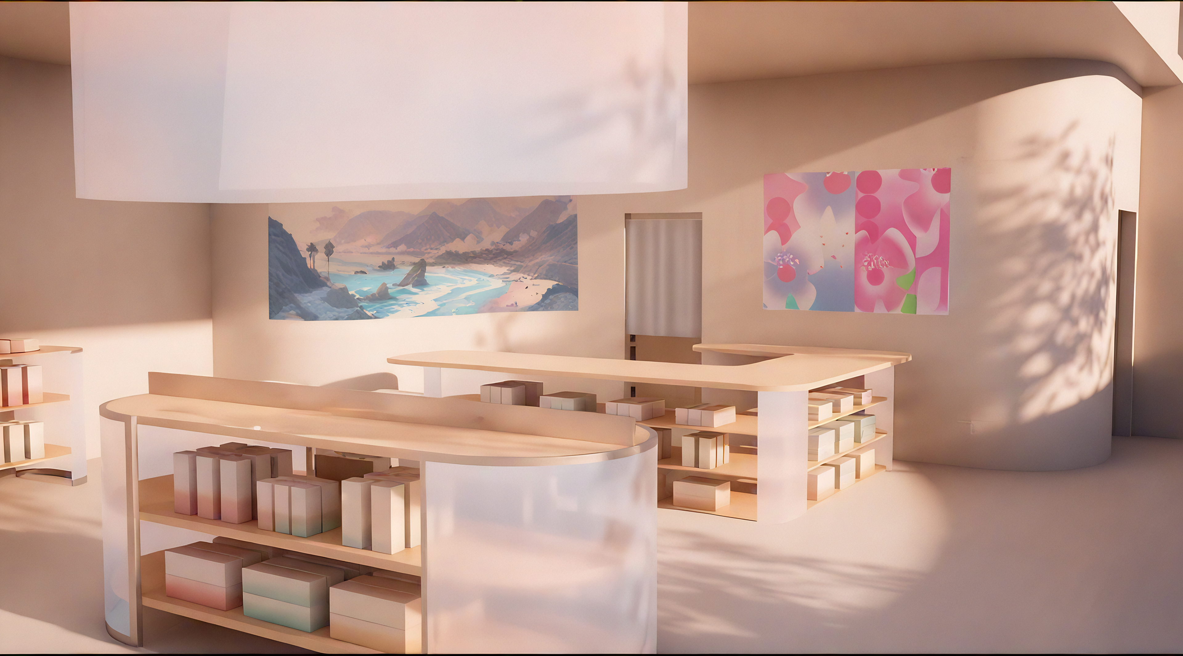
Product & Package Designs
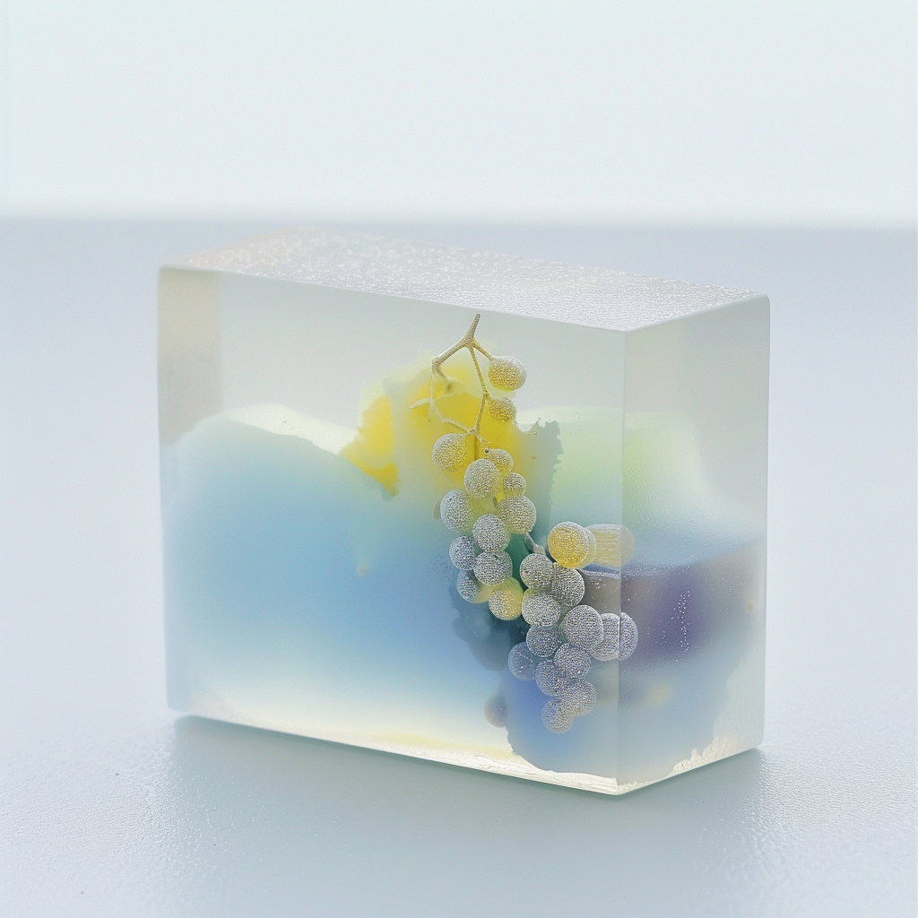
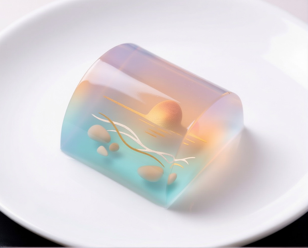
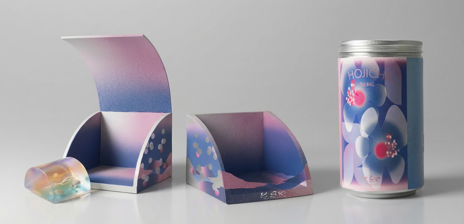
Product and package designs developed in Blender, featuring original yokan forms and custom packaging for both tea and confectionery. Each product was inspired by California landscapes: Joshua tree, Napa Valley, Santa Monica.

This design translates the desert landscape into form and color, drawing from arid textures, muted earth tones, and the quiet stillness of California’s high desert.
Soft gradients and layered translucency reflect vineyard rhythms, seasonal harvests, and the cultivated calm of California’s wine country.
Lighter tones and fluid geometry reference coastal light, ocean movement, and the relaxed openness of Southern California’s shoreline.
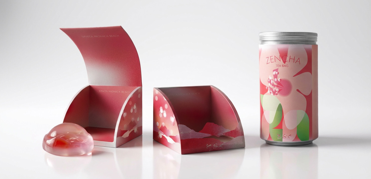
Joshua Tree - Warm red and pink gradations evoke the stillness and heat of the desert, transforming the quiet intensity of the landscape into a restrained, sculptural confection.
Santa Monica - Soft blue and pink tones capture the shifting colors of sunset along the coast, translating ocean light and beach atmosphere into a gentle, translucent form.
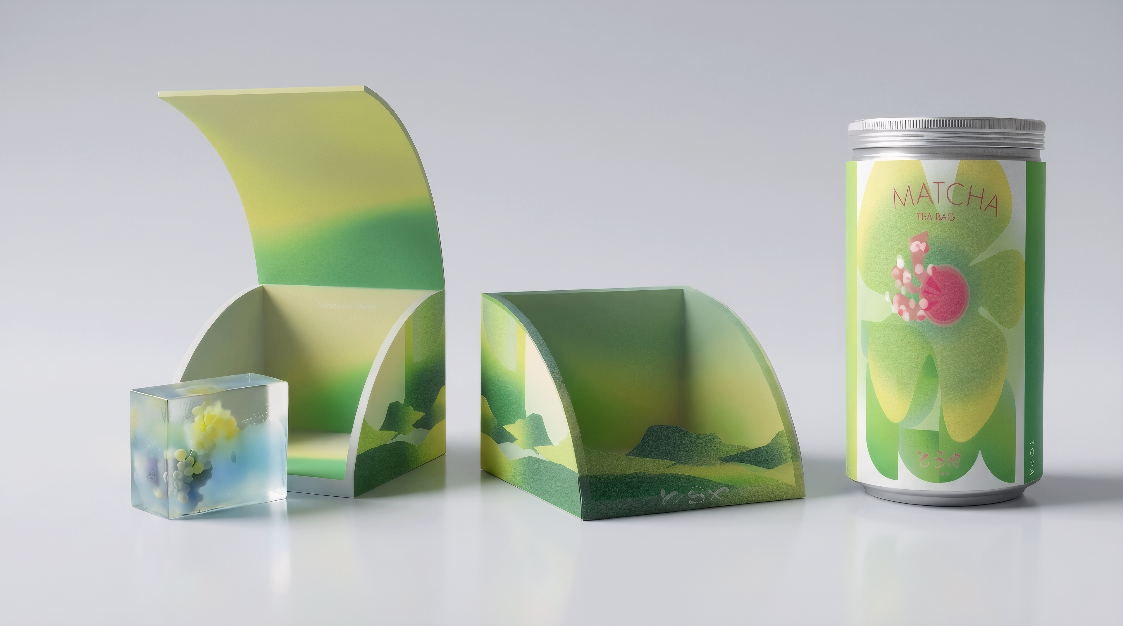
Napa Valley - Layered green hues reflect vineyard landscapes and agricultural rhythm, expressing seasonality, cultivation, and the depth of matcha through color.
Final Project Film - Spatial Walkthrough of Toraya LA Store
A three-minute film communicating the full spatial narrative of Toraya Teahouse LA, guiding viewers through circulation, transitions, and moments of pause.