WHITE RABBIT
WHITE RABBIT
WHITE RABBIT
Project Overview
Project Overview
White Rabbit — Love, Sealed with Sweetness is a spatial retail experience that transforms the iconic milk candy into a messenger of love.
Designed for a digitally disconnected generation, the space invites visitors to slow down and rediscover the joy of physical expression through a personalized gifting journey — choosing sweets, writing notes, wrapping care packages, and sending them with intention.
White Rabbit — Love, Sealed with Sweetness is a spatial retail experience that transforms the iconic milk candy into a messenger of love.
Designed for a digitally disconnected generation, the space invites visitors to slow down and rediscover the joy of physical expression through a personalized gifting journey — choosing sweets, writing notes, wrapping care packages, and sending them with intention.
Project Type
Branded Retail Experience
Individual Project
ArtCenter College of Design
Year
Spring 2025
Role
Concept development, spatial design, branding, narrative development, 3D modeling, rendering, and visual storytelling
Tools
Rhino, Unreal Engine, Photoshop, Illustrator, After Effects, Premiere Pro, Procreate
Project Overview
White Rabbit — Love, Sealed with Sweetness is a spatial retail experience that transforms the iconic milk candy into a messenger of love.
Designed for a digitally disconnected generation, the space invites visitors to slow down and rediscover the joy of physical expression through a personalized gifting journey — choosing sweets, writing notes, wrapping care packages, and sending them with intention.
Project Type
Branded Retail Experience
Individual Project
ArtCenter College of Design
Year
Spring 2025
Role
Concept development, spatial design, branding, narrative development, 3D modeling, rendering, and visual storytelling
Tools
Rhino, Unreal Engine, Photoshop, Illustrator, After Effects, Premiere Pro, Procreate
Core Concept — From Candy to a Messenger of Love
Core Concept — From Candy to a Messenger of Love
In a world of text messages, notifications, and quick digital reactions, White Rabbit asks a simple question:
What if affection could become physical again?
The project reimagines candy not as a product to consume, but as a small messenger of care. Through selecting, customizing, wrapping, and sending, visitors turn a familiar sweet into a tangible expression of love.
In a world of text messages, notifications, and quick digital reactions, White Rabbit asks a simple question:
What if affection could become physical again?
The project reimagines candy not as a product to consume, but as a small messenger of care. Through selecting, customizing, wrapping, and sending, visitors turn a familiar sweet into a tangible expression of love.


Core Concept — From Candy to a Messenger of Love
In a world of text messages, notifications, and quick digital reactions, White Rabbit asks a simple question:
What if affection could become physical again?
The project reimagines candy not as a product to consume, but as a small messenger of care. Through selecting, customizing, wrapping, and sending, visitors turn a familiar sweet into a tangible expression of love.
Spatial Language — Nostalgic Fantasia
Spatial Language — Nostalgic Fantasia
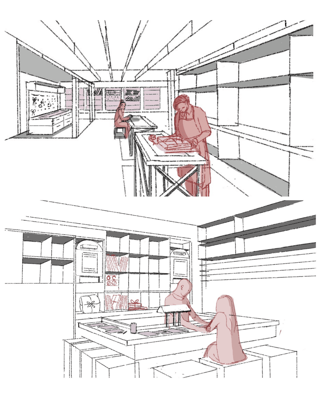
The spatial language is built around the idea of nostalgic fantasia — a dreamlike world that feels both familiar and imagined.
Historical arch forms inspired by old Shanghai’s Shikumen architecture ground the project in memory, while pastel colors, soft lighting, and whimsical proportions create a playful sense of wonder. The result is a space that feels like stepping into a childhood memory, softened and reimagined as an immersive retail experience.
The spatial language is built around the idea of nostalgic fantasia — a dreamlike world that feels both familiar and imagined.
Historical arch forms inspired by old Shanghai’s Shikumen architecture ground the project in memory, while pastel colors, soft lighting, and whimsical proportions create a playful sense of wonder. The result is a space that feels like stepping into a childhood memory, softened and reimagined as an immersive retail experience.


Spatial Language — Nostalgic Fantasia
The spatial language is built around the idea of nostalgic fantasia — a dreamlike world that feels both familiar and imagined.
Historical arch forms inspired by old Shanghai’s Shikumen architecture ground the project in memory, while pastel colors, soft lighting, and whimsical proportions create a playful sense of wonder. The result is a space that feels like stepping into a childhood memory, softened and reimagined as an immersive retail experience.
Brand Identity / Logotype Design
Brand Identity / Logotype Design

The logotype was developed by modifying a classic serif typeface to create a nostalgic yet refined identity.
By mirroring the letter “b,” the mark forms the image of two rabbit noses touching — a subtle gesture that symbolizes togetherness, sharing, and connection. This small detail reflects the larger experience: a brand world built around warmth, care, and quiet exchange.
The logotype was developed by modifying a classic serif typeface to create a nostalgic yet refined identity.
By mirroring the letter “b,” the mark forms the image of two rabbit noses touching — a subtle gesture that symbolizes togetherness, sharing, and connection. This small detail reflects the larger experience: a brand world built around warmth, care, and quiet exchange.
Brand Identity / Logotype Design
The logotype was developed by modifying a classic serif typeface to create a nostalgic yet refined identity.
By mirroring the letter “b,” the mark forms the image of two rabbit noses touching — a subtle gesture that symbolizes togetherness, sharing, and connection. This small detail reflects the larger experience: a brand world built around warmth, care, and quiet exchange.
Material & Color Strategy
Material & Color Strategy

The material and color strategy translates White Rabbit’s nostalgic sweetness into a soft, tactile environment.
A palette of pink, moss green, brown, beige, and light blue is derived from the original White Rabbit wrapper, then softened into pastel tones to create a sense of comfort, memory, and playfulness.
Materials such as clay plaster, stucco, oakwood, wool, and nordic brass add warmth and tactility. Together, they make the space feel handmade, intimate, and gift-like — a physical extension of care.
The material and color strategy translates White Rabbit’s nostalgic sweetness into a soft, tactile environment.
A palette of pink, moss green, brown, beige, and light blue is derived from the original White Rabbit wrapper, then softened into pastel tones to create a sense of comfort, memory, and playfulness.
Materials such as clay plaster, stucco, oakwood, wool, and nordic brass add warmth and tactility. Together, they make the space feel handmade, intimate, and gift-like — a physical extension of care.
Material & Color Strategy
The material and color strategy translates White Rabbit’s nostalgic sweetness into a soft, tactile environment.
A palette of pink, moss green, brown, beige, and light blue is derived from the original White Rabbit wrapper, then softened into pastel tones to create a sense of comfort, memory, and playfulness.
Materials such as clay plaster, stucco, oakwood, wool, and nordic brass add warmth and tactility. Together, they make the space feel handmade, intimate, and gift-like — a physical extension of care.
Spatial Strategy — A Journey Like Walking Through a Love Letter
Spatial Strategy — A Journey Like Walking Through a Love Letter
The layout guides visitors through a clear one-way journey: entry, selection, customization, package selection, supplies pickup, checkout, and postbox send-off. This linear flow creates a natural rhythm through the space. Each zone adds another layer of intention, turning a simple retail visit into a sequence of care, choice, and personal expression.
The layout guides visitors through a clear one-way journey: entry, selection, customization, package selection, supplies pickup, checkout, and postbox send-off. This linear flow creates a natural rhythm through the space. Each zone adds another layer of intention, turning a simple retail visit into a sequence of care, choice, and personal expression.


Spatial Strategy — A Journey Like Walking Through a Love Letter
The layout guides visitors through a clear one-way journey: entry, selection, customization, package selection, supplies pickup, checkout, and postbox send-off. This linear flow creates a natural rhythm through the space. Each zone adds another layer of intention, turning a simple retail visit into a sequence of care, choice, and personal expression.
Spatial Experience Walkthrough
Spatial Experience Walkthrough
The experience unfolds as a sequence of emotional gestures. Visitors enter through a portal-like facade, choose sweets for someone they care about, personalize a package, and complete the journey through a postbox-inspired send-off.
The experience unfolds as a sequence of emotional gestures. Visitors enter through a portal-like facade, choose sweets for someone they care about, personalize a package, and complete the journey through a postbox-inspired send-off.


Spatial Experience Walkthrough
The experience unfolds as a sequence of emotional gestures. Visitors enter through a portal-like facade, choose sweets for someone they care about, personalize a package, and complete the journey through a postbox-inspired send-off.
Narrative Sketches
Narrative Sketches
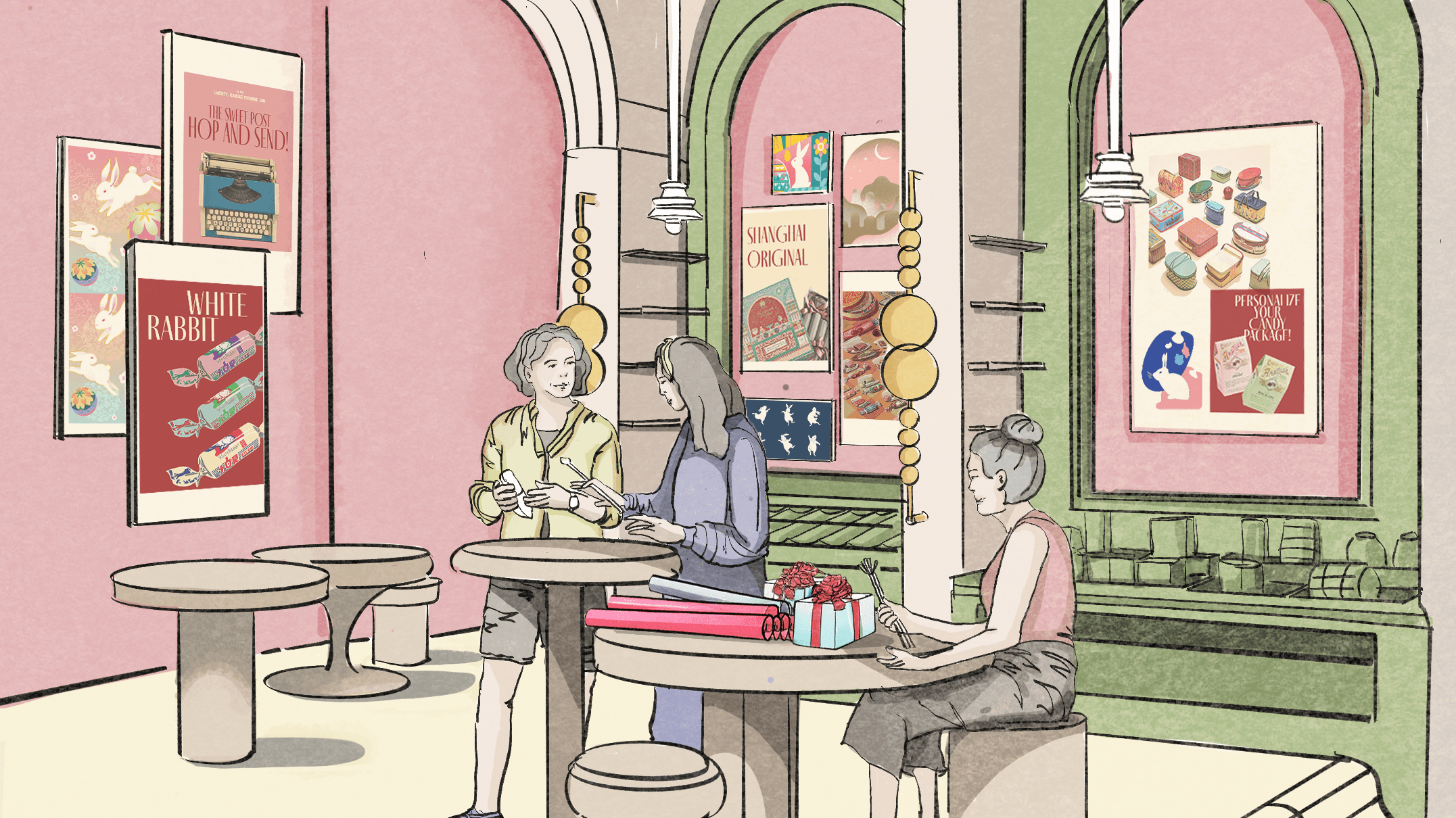
Sketching was used to develop the project’s emotional sequence, spatial rhythm, and interaction moments. Early studies explored how arches, counters, display walls, and wrapping stations could support both playful social interaction and quieter moments of reflection.
Sketching was used to develop the project’s emotional sequence, spatial rhythm, and interaction moments. Early studies explored how arches, counters, display walls, and wrapping stations could support both playful social interaction and quieter moments of reflection.


Narrative Sketches
Sketching was used to develop the project’s emotional sequence, spatial rhythm, and interaction moments. Early studies explored how arches, counters, display walls, and wrapping stations could support both playful social interaction and quieter moments of reflection.
Design Takeaway
Design Takeaway
White Rabbit explores how a familiar candy brand can become a spatial ritual of affection. By combining nostalgic brand memory, tactile interaction, and a guided gifting journey, the project turns retail into a slower and more meaningful act of connection.
Love is not just selected. It is written, wrapped, sealed, and shared.
White Rabbit explores how a familiar candy brand can become a spatial ritual of affection. By combining nostalgic brand memory, tactile interaction, and a guided gifting journey, the project turns retail into a slower and more meaningful act of connection.
Love is not just selected. It is written, wrapped, sealed, and shared.
Design Takeaway
White Rabbit explores how a familiar candy brand can become a spatial ritual of affection. By combining nostalgic brand memory, tactile interaction, and a guided gifting journey, the project turns retail into a slower and more meaningful act of connection.
Love is not just selected. It is written, wrapped, sealed, and shared.