BRANDED RETAIL EXPERIENCE / SPRING 2025
WHITE RABBIT
WHITE RABBIT
Love, Sealed with Sweetness
A personalized gifting journey that turns a familiar sweet into a physical expression of care.
A personalized gifting journey that turns a familiar sweet into a physical expression of care.
The heart of the experience: choosing, making, and giving share one space. / Concept rendering video
BRANDED RETAIL EXPERIENCE / SPRING 2025
WHITE RABBIT
Love, Sealed with Sweetness
A personalized gifting journey that turns a familiar sweet into a physical expression of care.
The heart of the experience: choosing, making, and giving share one space. / Concept rendering video
PROJECT
Individual academic project
ArtCenter College of Design / Spring 2025
Branded Retail Experience
MY ROLE
Concept, spatial design, branding, narrative development, 3D modeling and visualization
Concept, spatial design, branding, narrative development, 3D modeling and visualization
TOOLS
Rhino, Unreal Engine, Photoshop, Illustrator, After Effects, Premiere Pro, Procreate
Rhino, Unreal Engine, Photoshop, Illustrator, After Effects, Premiere Pro, Procreate
PROJECT
Individual academic project
ArtCenter College of Design / Spring 2025
MY ROLE
Concept, spatial design, branding, narrative development, 3D modeling and visualization
TOOLS
Rhino, Unreal Engine, Photoshop, Illustrator, After Effects, Premiere Pro, Procreate
WHY WHITE RABBIT
WHY WHITE RABBIT
What if affection could become physical again?
What if affection could become physical again?
I started with a question about how we express care when so much of our communication happens through screens. What might a space offer through touch, time, and personal effort?
White Rabbit became a way to explore that question: a familiar candy transformed through choosing, writing, wrapping, and sending.

SELECTED BRAND / WHITE RABBIT
A familiar sweet, carrying generations of memories.
White Rabbit (大白兔) is an iconic Chinese milk candy brand associated with childhood and the simple joy of sharing sweets. Its recognizable rabbit illustration and blue, white, and red wrapper make it a nostalgic touchstone for many people who grew up with it.
For this project, I chose White Rabbit as the starting point for a personalized gifting experience—extending those associations of familiarity and affection into the acts of choosing, writing, wrapping, and sending.
DESIGN PROCESS / FORMING THE CONCEPT
What makes a gift feel personal?
I brought candy, handwritten notes, parcels, and postal objects together in a digital collage to explore how a small sweet could carry a larger gesture of care.
I brought candy, handwritten notes, parcels, and postal objects together in a digital collage to explore how a small sweet could carry a larger gesture of care.

WORDS MAKE IT PERSONAL
Handwritten notes and wrappers suggest a gift that carries the sender’s own voice.
Handwritten notes and wrappers suggest a gift that carries the sender’s own voice.
EFFORT BECOMES VISIBLE
Paper, ribbon, and seals make the time spent preparing a gift part of its meaning.
Paper, ribbon, and seals make the time spent preparing a gift part of its meaning.
CARE TRAVELS ONWARD
The parcel and mailbox extend the story from making something to sharing it.
The parcel and mailbox extend the story from making something to sharing it.
DEFINING THE EMOTIONAL QUALITIES
An atmosphere shaped by care.
The key attributes establish the emotional brief for the space: intimate, evocative, inclusive, tangible, reverent, and appreciative.

INTIMATE + TANGIBLE
Give personal expression a physical setting through touch, materials, and time at a table.
EVOCATIVE + REVERENT
Carry familiar memories into the space, with attention to the small rituals of giving.
INCLUSIVE + APPRECIATIVE
Make room for shared activity and individual gestures, centered on the person receiving the gift.
DESIGN PROCESS / TRANSLATING FEELING INTO SPACE
Building a nostalgic fantasia.
The spatial references bring together familiarity and imagination. Arches, warm interiors, and playful proportions suggest a world that feels remembered and newly discovered.
The spatial references bring together familiarity and imagination. Arches, warm interiors, and playful proportions suggest a world that feels remembered and newly discovered.

Spatial language collage / Reference imagery and an early spatial interpretation
MEMORY AS A STARTING POINT
The concept draws on old Shanghai’s Shikumen architecture to connect the brand’s nostalgic associations with a spatial sense of familiarity.
The concept draws on old Shanghai’s Shikumen architecture to connect the brand’s nostalgic associations with a spatial sense of familiarity.
A PLAYFUL INTERPRETATION
Wes Anderson’s use of color and composed, whimsical settings informed the imagined atmosphere. Pastels and rounded forms soften the architectural references.
Wes Anderson’s use of color and composed, whimsical settings informed the imagined atmosphere. Pastels and rounded forms soften the architectural references.
FROM REFERENCE TO DRAWING
The collage places an early interior study alongside the references, beginning to translate those qualities into arches, displays, seating, and suspended elements.
The collage places an early interior study alongside the references, beginning to translate those qualities into arches, displays, seating, and suspended elements.
EXPLORING FORM AND ACTIVITY
Sketching the setting—and what happens in it.
The studies explore two connected questions: how the store creates a sense of wonder, and how its furniture and stations support the act of making a gift.
The studies explore two connected questions: how the store creates a sense of wonder, and how its furniture and stations support the act of making a gift.

WHAT KIND OF WORLD DO VISITORS ENTER?
Arched enclosures, overhead objects, display edges, and shared tables explore the relationship between an expressive interior and everyday activity.
Arched enclosures, overhead objects, display edges, and shared tables explore the relationship between an expressive interior and everyday activity.
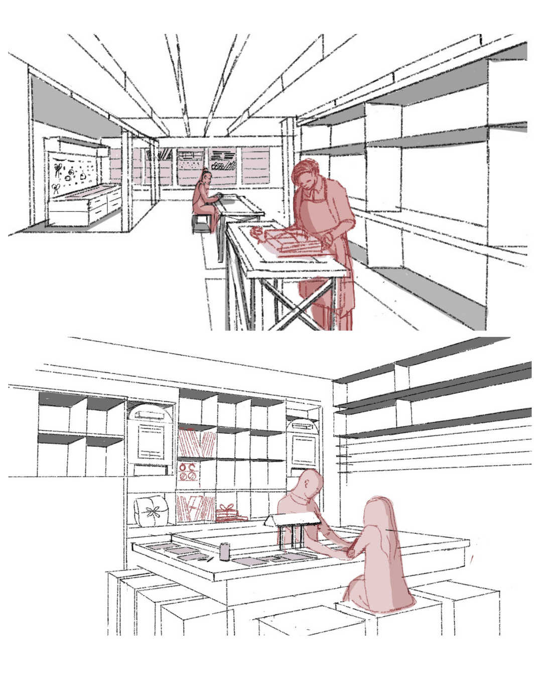
WHERE DOES PERSONAL EXPRESSION HAPPEN?
Counter and workstation studies bring tools, supplies, and the visitor’s actions into focus. They show the practical interactions behind the larger gifting concept.
Counter and workstation studies bring tools, supplies, and the visitor’s actions into focus. They show the practical interactions behind the larger gifting concept.
WHY WHITE RABBIT
What if affection could become physical again?
I started with a question about how we express care when so much of our communication happens through screens. What might a space offer through touch, time, and personal effort?
White Rabbit became a way to explore that question: a familiar candy transformed through choosing, writing, wrapping, and sending.
SELECTED BRAND / WHITE RABBIT
A familiar sweet, carrying generations of memories.
White Rabbit (大白兔) is an iconic Chinese milk candy brand associated with childhood and the simple joy of sharing sweets. Its recognizable rabbit illustration and blue, white, and red wrapper make it a nostalgic touchstone for many people who grew up with it.
For this project, I chose White Rabbit as the starting point for a personalized gifting experience—extending those associations of familiarity and affection into the acts of choosing, writing, wrapping, and sending.
DESIGN PROCESS / FORMING THE CONCEPT
What makes a gift feel personal?
I brought candy, handwritten notes, parcels, and postal objects together in a digital collage to explore how a small sweet could carry a larger gesture of care.
WORDS MAKE IT PERSONAL
Handwritten notes and wrappers suggest a gift that carries the sender’s own voice.
EFFORT BECOMES VISIBLE
Paper, ribbon, and seals make the time spent preparing a gift part of its meaning.
CARE TRAVELS ONWARD
The parcel and mailbox extend the story from making something to sharing it.
DEFINING THE EMOTIONAL QUALITIES
An atmosphere shaped by care.
The key attributes establish the emotional brief for the space: intimate, evocative, inclusive, tangible, reverent, and appreciative.
INTIMATE + TANGIBLE
Give personal expression a physical setting through touch, materials, and time at a table.
EVOCATIVE + REVERENT
Carry familiar memories into the space, with attention to the small rituals of giving.
INCLUSIVE + APPRECIATIVE
Make room for shared activity and individual gestures, centered on the person receiving the gift.
DESIGN PROCESS / TRANSLATING FEELING INTO SPACE
Building a nostalgic fantasia.
The spatial references bring together familiarity and imagination. Arches, warm interiors, and playful proportions suggest a world that feels remembered and newly discovered.
Spatial language collage / Reference imagery and an early spatial interpretation
MEMORY AS A STARTING POINT
The concept draws on old Shanghai’s Shikumen architecture to connect the brand’s nostalgic associations with a spatial sense of familiarity.
A PLAYFUL INTERPRETATION
Wes Anderson’s use of color and composed, whimsical settings informed the imagined atmosphere. Pastels and rounded forms soften the architectural references.
FROM REFERENCE TO DRAWING
The collage places an early interior study alongside the references, beginning to translate those qualities into arches, displays, seating, and suspended elements.
EXPLORING FORM AND ACTIVITY
Sketching the setting—and what happens in it.
The studies explore two connected questions: how the store creates a sense of wonder, and how its furniture and stations support the act of making a gift.
WHAT KIND OF WORLD DO VISITORS ENTER?
Arched enclosures, overhead objects, display edges, and shared tables explore the relationship between an expressive interior and everyday activity.
WHERE DOES PERSONAL EXPRESSION HAPPEN?
Counter and workstation studies bring tools, supplies, and the visitor’s actions into focus. They show the practical interactions behind the larger gifting concept.
THE DESIGN RESPONSE
Give each act of care a place in the store.
Give each act of care a place in the store.
The visitor helps complete the story. The space moves from the curiosity of arrival to the attention of choosing, the intimacy of making, and the anticipation of sending.
The visitor helps complete the story. The space moves from the curiosity of arrival to the attention of choosing, the intimacy of making, and the anticipation of sending.
01
Invite through familiarity
Layered arches and a warm, playful palette establish a nostalgic world.
Layered arches and a warm, playful palette establish a nostalgic world.
02
Make room for personal effort
Central worktables give writing, wrapping, and decorating a visible place.
Central worktables give writing, wrapping, and decorating a visible place.
03
Carry the experience outward
A P.O. box station gives the finished gift a destination beyond the shop.
A P.O. box station gives the finished gift a destination beyond the shop.
FOUR MOMENTS, ONE GIFTING JOURNEY

01 / ARRIVE
Step into a nostalgic world.
Step into a nostalgic world.
Layered entrance and outdoor threshold
Layered entrance and outdoor threshold
02 / CHOOSE
Think of someone as you select.
Think of someone as you select.
Candy and dessert displays
Candy and dessert displays
03 / MAKE IT PERSONAL
Put your care into the gift.
Put your care into the gift.
Packaging, supplies, and shared worktables
Packaging, supplies, and shared worktables
04 / SEND
Let the gesture travel onward.
Let the gesture travel onward.
P.O. box station and departure
P.O. box station and departure
01 / ARRIVE
Step into a nostalgic world.
Step into a nostalgic world.
Layered arches mark the passage from the street into a place for slower, more personal gestures.
Layered arches mark the passage from the street into a place for slower, more personal gestures.


THE VISITOR MOMENT
Approach the layered entrance, glimpse the activity inside, and cross into the store. Outdoor seating offers a place to pause at the threshold.
Approach the layered entrance, glimpse the activity inside, and cross into the store. Outdoor seating offers a place to pause at the threshold.
THE SPATIAL DECISION
The tunnel-like facade makes arrival a distinct moment. Arches inspired by old Shanghai’s Shikumen architecture are reinterpreted through softened forms and a playful palette.
The tunnel-like facade makes arrival a distinct moment. Arches inspired by old Shanghai’s Shikumen architecture are reinterpreted through softened forms and a playful palette.
EXPLORING THE THRESHOLD
Facade studies explore a canopy-led storefront and an arched enclosure. Read beside the final render, they make the development of the entrance’s form visible.
Facade studies explore a canopy-led storefront and an arched enclosure. Read beside the final render, they make the development of the entrance’s form visible.

Exploratory sketch / Canopy, storefront, and outdoor seating

Exploratory sketch / Repeated arches and a taller entrance
THE THRESHOLD AS A SOCIAL MOMENT

Narrative sketch / Arrival, conversation, and a place to linger
NOSTALGIC FANTASIA
Familiar, with a sense of wonder.
The narrative sketch shows the entrance through everyday activity: arriving, talking, and lingering. Warm colors and rounded forms bring a story-like quality to the final space.
The narrative sketch shows the entrance through everyday activity: arriving, talking, and lingering. Warm colors and rounded forms bring a story-like quality to the final space.
02 / CHOOSE
Choose with someone in mind.
Choose with someone in mind.
The first act of giving is attention: deciding what another person might enjoy.
The first act of giving is attention: deciding what another person might enjoy.
THE VISITOR MOMENT
Browse candies and desserts, then assemble a selection for someone you care about. A familiar purchase becomes the beginning of a personal gift.
Browse candies and desserts, then assemble a selection for someone you care about. A familiar purchase becomes the beginning of a personal gift.
Browse candies and desserts, then assemble a selection for someone you care about. A familiar purchase becomes the beginning of a personal gift.
THE SPATIAL DECISION
Candy and dessert displays sit along the glazed frontage. Their position introduces the products before the journey turns toward the making tables.
Candy and dessert displays sit along the glazed frontage. Their position introduces the products before the journey turns toward the making tables.
Candy and dessert displays sit along the glazed frontage. Their position introduces the products before the journey turns toward the making tables.

Candy and dessert selection / Concept rendering
DESIGNING THE ACT OF CHOOSING

Narrative sketch / The visitor in relation to the display
From looking to choosing.
The sketch brings the visitor into the display: reaching, looking closely, and deciding. The final render places that encounter within the larger route through the store.
The sketch brings the visitor into the display: reaching, looking closely, and deciding. The final render places that encounter within the larger route through the store.
The sketch brings the visitor into the display: reaching, looking closely, and deciding. The final render places that encounter within the larger route through the store.
03 / MAKE IT PERSONAL
Spend time making it theirs.
Spend time making it theirs.
Write a note. Choose the wrapping. Add a personal touch. The gift begins to carry more than sweetness.
Write a note. Choose the wrapping. Add a personal touch. The gift begins to carry more than sweetness.
Write a note. Choose the wrapping. Add a personal touch. The gift begins to carry more than sweetness.

Customization / Shared worktables at the center of the gifting experience
THE VISITOR MOMENT
Gather packaging and decorating supplies, settle at a table, and compose a gift. Writing and wrapping give care a physical form.
Gather packaging and decorating supplies, settle at a table, and compose a gift. Writing and wrapping give care a physical form.
Gather packaging and decorating supplies, settle at a table, and compose a gift. Writing and wrapping give care a physical form.
THE SPATIAL DECISION
Worktables occupy the center of the store, with packages and supplies along the wall. Preparing a gift becomes a visible activity, with room for both conversation and individual attention.
Worktables occupy the center of the store, with packages and supplies along the wall. Preparing a gift becomes a visible activity, with room for both conversation and individual attention.
Worktables occupy the center of the store, with packages and supplies along the wall. Preparing a gift becomes a visible activity, with room for both conversation and individual attention.
PROCESS / FROM SHARED ACTIVITY TO SHARED SPACE
Start with what people do together.

Process sketches / Conversation, making together, and a shared worktable setting
EXPLORING THE HUMAN MOMENTS
These studies explore conversation, quiet concentration, and making alongside others. They frame gifting as both a personal gesture and a shared activity.
These studies explore conversation, quiet concentration, and making alongside others. They frame gifting as both a personal gesture and a shared activity.
These studies explore conversation, quiet concentration, and making alongside others. They frame gifting as both a personal gesture and a shared activity.
TRANSLATING ACTIVITY INTO SPACE
The lower drawing places these interactions around worktables, seating, and supplies. Read together, the sketches connect the desired social experience to the arrangement of the room.
The lower drawing places these interactions around worktables, seating, and supplies. Read together, the sketches connect the desired social experience to the arrangement of the room.
The lower drawing places these interactions around worktables, seating, and supplies. Read together, the sketches connect the desired social experience to the arrangement of the room.
CARRIED INTO THE FINAL EXPERIENCE
In the final design, shared tables keep making visible while giving each visitor a place to work on a personal gift.
In the final design, shared tables keep making visible while giving each visitor a place to work on a personal gift.
In the final design, shared tables keep making visible while giving each visitor a place to work on a personal gift.
SKETCHING THE SOCIAL MOMENT
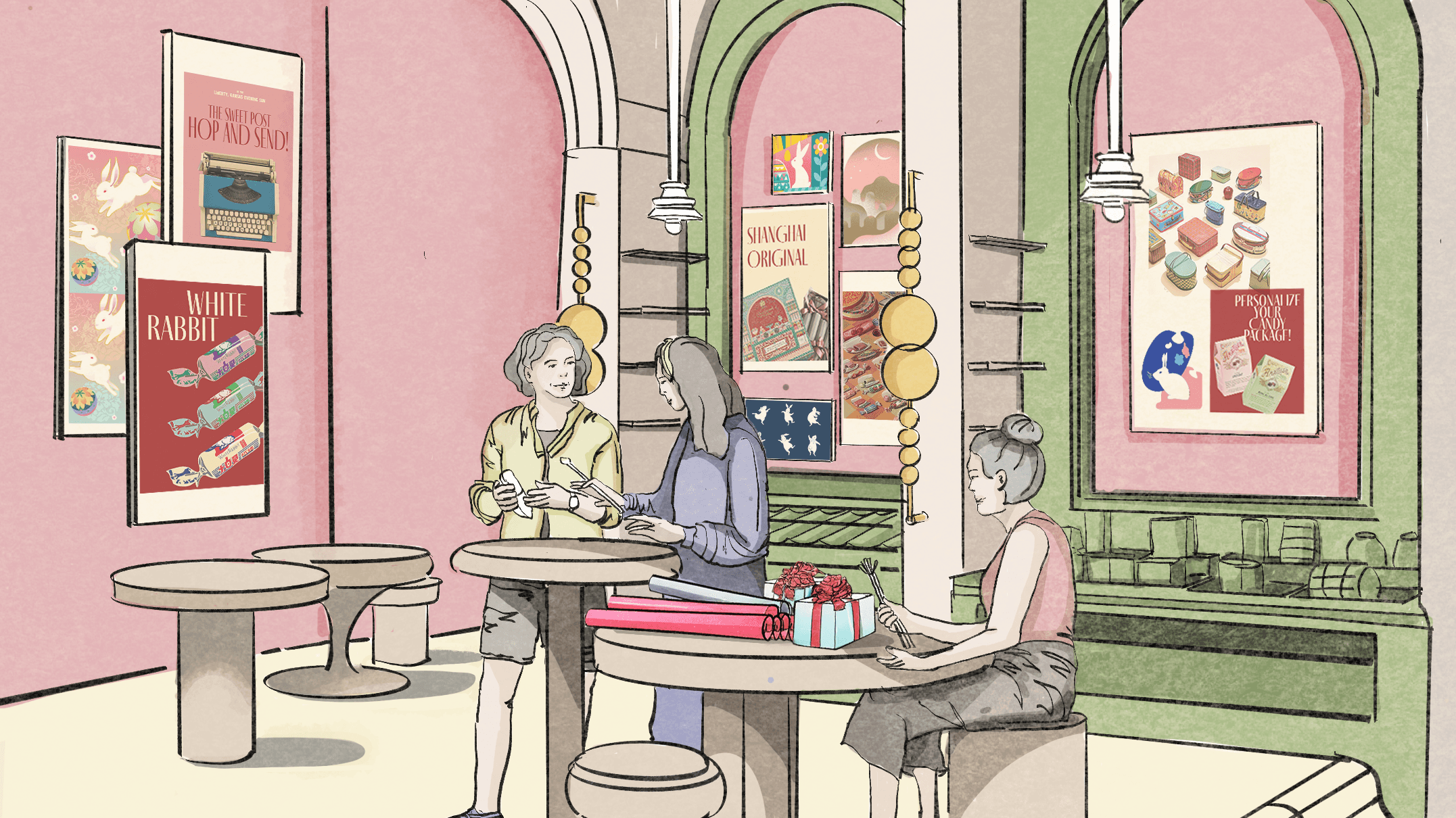
Hand-drawn narrative sketch / Making together, with room for a personal gesture

A TACTILE SETTING
Oakwood, clay plaster, soft finishes, and warm pastel tones support the intimate, hands-on character of the space.
Oakwood, clay plaster, soft finishes, and warm pastel tones support the intimate, hands-on character of the space.
04 / SEND
Send a little of yourself.
Send a little of yourself.
Send the gift at the P.O. box, then pay at the counter and leave. The gesture continues beyond the store.
Send the gift at the P.O. box, then pay at the counter and leave. The gesture continues beyond the store.
Send the gift at the P.O. box, then pay at the counter and leave. The gesture continues beyond the store.

P.O. box station / The destination for the completed gift
THE VISITOR MOMENT
Bring the wrapped package to the P.O. box station for sending to a loved one. Then complete payment at the counter before leaving the store.
Bring the wrapped package to the P.O. box station for sending to a loved one. Then complete payment at the counter before leaving the store.
Bring the wrapped package to the P.O. box station for sending to a loved one. Then complete payment at the counter before leaving the store.
THE SPATIAL DECISION
The P.O. box gives the personal gesture a destination. Checkout then completes the visit, creating a clear sequence from sending to payment and departure.
The P.O. box gives the personal gesture a destination. Checkout then completes the visit, creating a clear sequence from sending to payment and departure.
The P.O. box gives the personal gesture a destination. Checkout then completes the visit, creating a clear sequence from sending to payment and departure.
COMPLETING THE VISIT
Send it. Pay. Carry the feeling with you.
Send it. Pay. Carry the feeling with you.
01 / SEND AT THE P.O. BOX

Hand-drawn narrative sketches
02 / PAY AND LEAVE

DEVELOPING THE POSTAL IDEA
The “Hop and Send” studies explore how signage, supplies, and a dedicated station can make the sending ritual legible. The narrative drawings above show how that ritual connects to checkout and departure.
The “Hop and Send” studies explore how signage, supplies, and a dedicated station can make the sending ritual legible. The narrative drawings above show how that ritual connects to checkout and departure.
The “Hop and Send” studies explore how signage, supplies, and a dedicated station can make the sending ritual legible. The narrative drawings above show how that ritual connects to checkout and departure.


Postal station studies: signage, supplies, and the sending ritual.
DESIGN DEVELOPMENT / SPATIAL PLANNING
A plan organized around giving.
The route connects product selection, supplies, and shared worktables before continuing to the P.O. box, checkout, and exit. The plan gives practical support to the emotional sequence.
The route connects product selection, supplies, and shared worktables before continuing to the P.O. box, checkout, and exit. The plan gives practical support to the emotional sequence.
The route connects product selection, supplies, and shared worktables before continuing to the P.O. box, checkout, and exit. The plan gives practical support to the emotional sequence.

FORM HOLDS THE SEQUENCE
The section connects the vaulted enclosure with the worktables, display walls, and suspended installations. Large arches frame a series of smaller, human-scale activities.
The section connects the vaulted enclosure with the worktables, display walls, and suspended installations. Large arches frame a series of smaller, human-scale activities.
The section connects the vaulted enclosure with the worktables, display walls, and suspended installations. Large arches frame a series of smaller, human-scale activities.

BRAND IDENTITY / A GESTURE OF CONNECTION
Care, down to the letter.
I mirrored the letter B so the paired forms suggest two rabbit noses touching. That small gesture of connection carries the project’s idea into its visual identity.
I mirrored the letter B so the paired forms suggest two rabbit noses touching. That small gesture of connection carries the project’s idea into its visual identity.
I mirrored the letter B so the paired forms suggest two rabbit noses touching. That small gesture of connection carries the project’s idea into its visual identity.
REFLECTION
Love, written, wrapped, sealed, and shared.
White Rabbit explores how spatial design can make the act of giving more deliberate. A display invites a choice; a table makes room for personal effort; a postbox carries the gesture onward.
The project brings brand storytelling and spatial sequencing together around a simple idea: care becomes tangible through what we do.